Currently, mobile phones account for almost 54.8% of the global web traffic. As a result, it’s no longer enough to have a successful website with just a static website.
Your website might hit a maximum score on a computer screen. However, are you sure a mobile user would have the same experience on your website? Well, that’s what we’re here to change.
Setting your website content into singular columns isn’t what a mobile user yearns for. What you need for your online presence is a “Responsive web design.”
This piece is a walkthrough of everything you need to know about responsive web design.
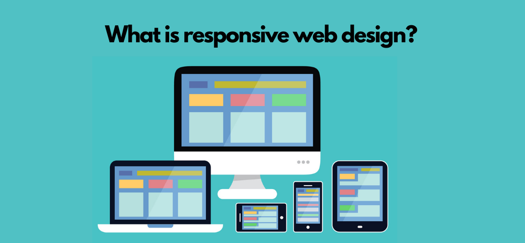
Defining A Responsive Web Design
Responsive web design is a unique approach to web design that allows the content to be adapted to different screen sizes.
For instance, your website might appear in different columns and layouts on a laptop. It is because a desktop or laptop screen is wide enough to accommodate it.
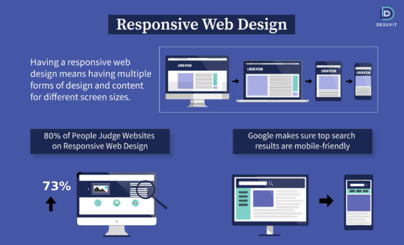
However, the very same layout might not be feasible to understand on a mobile device. Having a responsive web design means having separate, multiple forms of design and content for different screen sizes.
Why Does A Responsive Design Matter?
If you are new to blogging and web development, responsiveness might not be your primary thought. In any case, it’s time developers understand that it’s no longer to design web pages for a single device.
If your web pages are hard to navigate and read, it can lead to a poor user experience. Moreover, in the past few years, mobile phones have become the standard advertising channel.
In the post-pandemic world, spending on mobile ads grew 4.8% to $91.52 billion. Whether you choose Youtube SEO or advertise on social media, your target audience should be mobile users.
Lacking conversion rates will result in nothing but wasted ad spend and fewer than expected leads.
Responsive Web Design – How Does It Work?
Do you know that 73% of the people might reject your website at the sight of a non-responsive design? For this reason, you have to make sure that you adopt a responsive page design.
A responsive design uses CSS and pixel values known as breakpoints. These breakpoints adhere to screen size and site layout.
The overall web content design and layout adapt to offer the best appearance to the user. The designers and developers have to make changes to the web design at the breakpoints.
Designers must keep in mind the most typical screen sizes and then begin with sizing and customizing the breakpoints. After successfully adding the breakpoint, they add one design above the breakpoint and one below.
As a result, whenever the viewing screen sizes increase or decrease, the web design automatically reshuffles the elements in the page.
How To Assess Whether Your Website Is Responsive?
If you want to understand whether or not your website is responsive, you can test it through Google Chrome. Press Ctrl+Shift+l to open Chrome DevTools and then Ctrl+Shift+M to toggle the device toolbar.
-

Your End-To-End Guide To Help You Plan And Build Web Applications
Here’s the free guide to Answers to all your Web development Queries
After this, you can view the website from all devices to understand and assess its responsiveness.
Furthermore, you can make use of Google’s mobile-friendly test tool for this purpose. However, bear in mind that a mobile-friendly website is not always a responsive website.
Once you figure out the responsiveness level of your web design, you can hire a professional to fix things.
How To Make Your Site Responsive?
It’s natural if you’re searching for ways to make your site more responsive after reading the earlier facts and details.
Now that you’re familiar with the essential elements, it’s time to make your website responsive. Here are some steps to make your site more responsive:
Use Responsive Typography
One of the primary focuses of responsive web design is the responsiveness of elements, media, and blocks. Most people consider the text as an afterthought.
If you are looking to make your web design responsive truly, consider adjusting your font size. The font size should be in sync with your screen size. Also, font type plays a significant role in lead conversion.
Usability News researched different effects of different font types, and the results were astonishing. We suggest that you settle for a static value of 22 px and adapt each in the media query.
-

Follow our tech founder for more valuable tips, tricks, learning, content and future opportunities
Adopt Responsive Images
Another way to make sure that your web design is responsive is by including responsive images. Use a dynamic value for all the pictures if you don’t want them to break.
However, this will not help you reduce your mobile visitors’ load whenever they access your web pages.
In the HTML, make sure to use “srcset” with different image sizes.
You should know that manually carrying this step out takes a chunk of time. On the other hand, WordPress and other CMS automatically make it happen when you upload the files.
Use A CSS Grid Layout
Your next step in the process should be to determine different sizes for various layout elements. Make sure to keep screen breakpoint and media query in mind while doing this.
The variety and amount of layer containers you should have will depend on the web design. In any case, your website should focus on these elements:
- Footer
- Sidebar
- Content
- Header
- Container or wrapper
You can use the mobile-first strategy to style the main elements. Also, in the percentage-based approach, it is the float attribute on which side of the screen the element will appear.
If you are looking to make edgy and highly functional pages, you have to use CSS flexbox.
Determine Your Media Query Range
You might be having unique needs for your media query. For instance, if you wish to follow the Bootstrap standards for the design, we suggest the following queries:
- For large devices: 1200 px
- For laptops: 992 px
- For tablets: 768 px
- For portrait phones: 576 px
Final Thoughts
Different functional elements make up a responsive web design. If you lack a basic understanding of CSS and HTML, you are likely to commit mistakes.
However, by familiarizing yourself with the process and building blocks, you can get through. Make sure to keep testing as you go ahead using a sample code.
All this might sound too much to achieve, and that’s why you need a maestro like Desuvit. Desuvit’s team of professionals equip the best skill sets to deliver expected results. Connect with us today to build a responsive web design for your brand.
Desuvit is a Norway-born software development company delivering Custom Software Development, Mobile Apps, and Web Applications Development for various verticals and business domains. We offer end-to-end solutions for companies with no software or IT division, Startups, and companies that need to scale their software development efforts but lack the expertise required. We help our clients in growing their businesses so we can grow with them. Some of the technologies we work with: .Net, Azure, Microservices, Azure functions(Serverless computing), React Native, Flutter, React JS, TypeScript, Angular, NServiceBus, Azure Service Bus, Azure Queues, SQL Service, MySQL, Cosmos DB, etc.
Enjoyed this article? Subscribe for more valuable and great content !
By subscribing, you agree with our privacy policy and our terms of service.