Websites have evolved into an effective form of communicating and connecting with audiences; they are much more than text and information on a webpage.
There are few website qualities that contemporary modern users value and few that are much more than user-friendliness. For many, especially mobile users, a welcoming, functional, easy-to-use website will significantly inform their User Experience (UX). And yet, this simple web development principle is challenging to grasp fully or implement. For this reason, here are some tips on how to make your website more user-friendly quickly and without much effort.
What is website user-friendliness?
For a brief definition, which will help contextualize the following practices, user-friendliness is, in essence, functionality, and responsiveness. Descriptions differ, but most maintain this approach; LinkedIn’s Talha Shabaz, for instance, equates it to usability.
In the simplest of terms, the term describes how easy your website is to access, navigate, and interact with. User-friendliness is a crucial component of website UX design, as we’ve highlighted before, and is, therefore, critical to success.
What are the benefits of a user-friendly website?
Naturally, it follows that better user-friendliness translates to a better UX and entails all the benefits that follow it. While these are plenty, and our article above also touches on them, here we may briefly outline three main ones.
#1 More conversions
First, user-friendliness helps drive conversions. Responsiveness, more straightforward navigation and better content readability all increase the chances that your CTAs are found.
It will not do so alone, of course. Conversion Rate Optimization (CRO) and CTA-specific refinements will also be needed to improve your conversion rate, from copy refinements to your choice of color, as MoversDev suggests.
Still, user-friendliness is a crucial component of this journey; it will offer a more pleasant and meaningful path to conversions. As it does, user-friendliness principles also touch on CTAs – as we’ll see next.
-

Follow our tech founder for more valuable tips, tricks, learning, content and future opportunities
#2 Better user engagement
Second, user engagement is another great incentive to make your website more user-friendly. Users love usability. In much the same way as user behavior impacts mobile development, so does its web design.
Granted, user engagement too will only be guaranteed by more than user-friendliness. Your content must also remain relevant, readable, and well-structured, in line with UX and SEO principles. Nonetheless, website usability will be instrumental to inciting engagement as it will entice visitors to stay and explore.
-

Your End-To-End Guide To Help You Plan And Build Web Applications
Here’s the free guide to Answers to all your Web development Queries
And while user engagement may not boost your SEO score, according to Google’s John Mueller, it still benefits your business.
#3 More customer retention
Finally, a key benefit of user-friendliness is that it increases customer retention. And predictably, a better experience makes customers more likely to return, remain loyal, and become repeat customers.
Google confirms this, finding that “88% of online consumers [are] less likely to return to a site after a bad user experience”. As it does, it also confirms our assertion on conversion rates above, finding that “well-designed user interfaces see a conversion rate of more than 200%”. Why this matters immensely in today’s competitive digital landscape should go without saying; customer acquisition costs much more than retention. LinkedIn’s Shaumik Saha quantifies this as a 7x difference, which can’t be ignored.
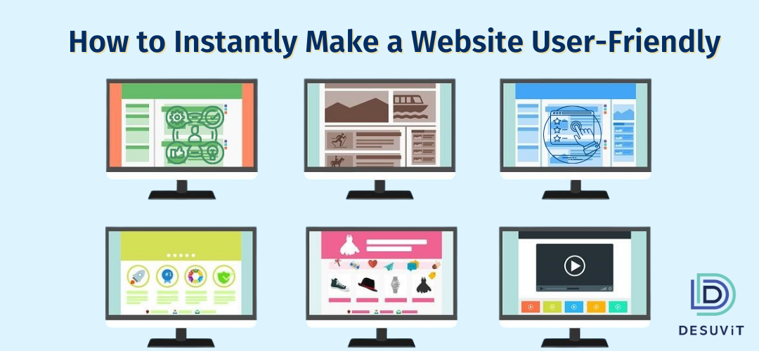
How to instantly make your website more user-friendly
With the above in mind, here we highlight seven key ways to ensure user-friendliness. In no particular order, consider the following.
#1 Reduce loading times
Initially, modern visitor values their time immensely. Your site only has a few seconds to finish loading before it starts losing visitors, making fast loading times crucial. Google finds that up to 3 seconds are tolerable, but more than that incurs exponential bounce rate likelihood.
The easiest ways to address this factor include the following:
- Compressing your images and media files while minding compromises in quality
- Culling heavy themes and plugins after weighing their benefits against their speed costs
- Avoiding URL redirects whenever possible, as they slow down the user’s experience
- Serving cached versions of your pages to returning visitors
- Cleaning up your media library and database
Depending on your website and expertise, other ways include using a CDN, minifying CSS and JavaScript, and streamlining your HTML. Consider changing web hosts if all else fails or doesn’t suffice.
#2 Enhance mobile-friendliness
Next, user-friendliness is, in many ways, synonymous with mobile-friendliness. A notable reason is that, as Statista finds, mobile traffic has surpassed desktop traffic for some years. Another is that catering to mobile devices benefits desktop devices as well, as the mobile-first design is heavily responsiveness-oriented. In other words, focusing on mobile devices will make your website more user-friendly for all users.
That said, mobile-friendliness relies more on general principles than on specific practices. For this goal, you can consider the following:
- Avoiding intrusive pop-ups
- Embracing responsive web design, as we’ve covered before
- De-cluttering your pages and layouts
- Choosing navigation options with less screen real estate in mind
- Testing your pages on mobile devices first
Thankfully, Google also offers a handy mobile-friendly test tool that can help you in this regard.
#3 Provide a sitemap
Moving on to navigation, an initial step to consider is to provide your users with a sitemap of your website. In much the same way XML sitemaps help Google navigate your website, HTML sitemaps help your users do so.
Granted, you can skip this if your website is smaller or you’re confident in your structure and navigation options. Still, doing so is relatively easy, as possible user-friendliness benefits and won’t harm your website.
Using WordPress, you can have a dedicated sitemap plugin do your work. If not, you may use free services like XML-sitemaps or paid solutions.
Remember to feature your sitemap in your homepage footer or even header for easier access when you’re done.
#4 Offer better navigation options and tighter structure
Having touched on navigation, you may then examine your navigation options. Only slight improvements on this front can make your website more user-friendly, as they’ll make it easier to explore. That’s particularly true as, according to Kinsta, “only 50% of internet users could predict where relevant content would be based on standard website navigation structure”.
If you’re following mobile-first principles, you’ve already set up a clean, easy-to-navigate website. If not, then:
- Flatten your navigation structure; link to main categories from your homepage and expand into sub-categories
- Leverage your footer; use the space to provide valuable links to engaged visitors who scroll
- Tighten your content’s internal links; make navigation to relevant pages easier by linking to them
Drop-down menus are also an option, but their use is questionable. For example, Nielsen Norman Group finds they can tremendously enhance UX but also have ample room for misuse.
Finally, you can allow the keyboard to focus on your search bar. This practice may not significantly enhance user-friendliness, but mouse-free navigation is an excellent asset for accessibility.
#5 Ensure content accessibility
On that subject, accessibility is an important quality to consider as well. Thankfully, both web design and SEO have continued to embrace this quality in recent years.
To be clear, the term refers to accessibility defined by the W3C Web Accessibility Initiative (WAI). That is, how accessible a website is for people with visual, cognitive, or other impairments and disabilities. In the US, adherence to WAI is mainly synonymous with Americans with Disabilities Act (ADA) compliance.
To ensure better accessibility and make your website more user-friendly in the process, you can begin by:
- Enabling keyboard-only navigation, as outlined above
- Examining your color contrasts, colors should not bleed into one another
- Adding alt. text to images, allowing screen readers to convey the images’ content, and adding captions to videos
For additional information and help, you can use the web accessibility evaluation tool WAVE. This handy tool offers extensive feedback that can help inform your adjustments.
#6 Improve content readability
Next, you can improve content readability. This will likely be familiar territory if you’ve been practicing SEO for a while.
The essence of content readability is simple; your content should be easy on the eyes, digestible, and logically structured. Therefore, you can follow equally simple practices like:
- Structuring your content logically; use one H1 per page, followed by H2s and subsequent H3s, H4s, etc for subtopics
- Formatting your content; use bullet lists, relevant images, and other appropriate elements to make reading easier
- Using bold fonts, Times New Roman, Calibri, and Arial are common safe choices for a readable copy
- Minding color contrasts; make sure your background colors don’t inhibit reading
- Using white space generously; letting your content breathe through white space can significantly increase page comprehension, as CrazyEgg reports
These qualities make it more scannable and enticing, pleasing users and enhancing your SEO score in the process. Moreover, they indirectly boost conversion rates by making content more engaging and your CTAs visually apparent.
#7 Polish your CTAs
Finally, a great way to make your website more user-friendly is to polish your CTAs. These practices, by default, enhance your conversion rates, but they can also improve UX.
CTA optimizations would require an article of their own, but you may initially do the following:
- CTA color and background contrast. HubSpot finds that red beats green as regards CTA colors, and bold, popping colors are generally safer. At the same time, ensure your CTA doesn’t bleed into the background.
- CTA copy and font. Ensure your font is bold and your copy is readable on the CTA for visual clarity. In addition, opt for a clear, concise copy that clearly states what happens next.
- Visual distractions. De-clutter your page from distracting visual elements near your CTA. Your users’ attention must be drawn to it and no other secondary elements.
- CTA placement. Place your CTA above the fold for easier access and better visibility. If its offer is more complex, consider placing it further down, as Joshua Turk advises.
- CTA volume. Limit each page to one CTA. Only consider additional CTAs if they’re all relevant to the page and valuable to you and the user.
The way these practices enhance user-friendliness is by making the outcomes of user actions clear. Users know exactly where to click to continue their desired journey and what will happen when they click. They’re not confused or frustrated by clicking on unclickable visual elements or struggling to find their way to a conversion.
Final thoughts
As you can see, making your website more user-friendly is far from challenging. Some practices toward this end require more effort, but they also come with other benefits; improved SEO, more conversions, and so on. Often, all it takes is a strategic approach with data-driven insights. If you need clarification on any practice, A/B testing should best guide you toward satisfying your unique audiences and users.
Still, if you find the process challenging or want to know more about how to make your website more user-friendly, feel free to contact us directly. We’ll be happy to review your project or ideas and help you grow your business to new heights.
Desuvit is a Norway-born software development company delivering Custom Software Development, Mobile Apps, and Web Applications Development for various verticals and business domains. We offer end-to-end solutions for companies with no software or IT division, Startups, and companies that need to scale their software development efforts but lack the expertise required. We help our clients in growing their businesses so we can grow with them. Some of the technologies we work with: .Net, Azure, Microservices, Azure functions(Serverless computing), React Native, Flutter, React JS, TypeScript, Angular, NServiceBus, Azure Service Bus, Azure Queues, SQL Service, MySQL, Cosmos DB, etc.
Enjoyed this article? Subscribe for more valuable and great content !
By subscribing, you agree with our privacy policy and our terms of service.